UX RESEARCH + UX DESIGN
Geopolitical Monitor
Website Redesign
A strategic approach to revamp the overall look and feel of a website
Role Overview
Key Activities
Heuristic evaluation
Comparative Analysis
Wireframing
Collaborations
Product
Engineering
UI Design
Project overview
Problem
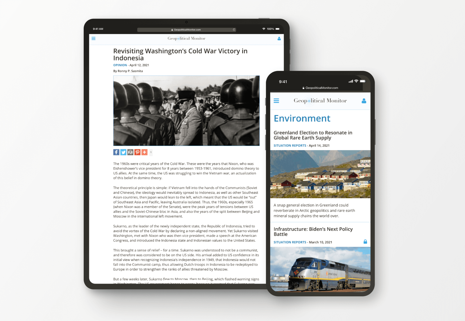
Working at Lush Concepts, we helped Geopolitical Monitor organize and structure a fresh image for its publication portal. The old version of the website was defying usability principles that needed to be adjusted. By doing so, it would bring the value their users were looking for, a place to read original, timely, and comprehensive analysis on events of international significance.
Solution
A revamped website that accurately aligns with the business goals and user’s expectations. Visit the live website.
Value
Redesigning GPM’s website meant getting more than a new look. It was about giving the right amount of content its visitors were anticipating when they needed it. In the end, everything translated to a better experience when users were able to effectively navigate the website. Thus, reducing the bounce rate.
Design Process
Define
- Problem Definition
- Target Audience
Research
- Heuristic Evaluation
- Comparative Analysis
Design
- Wireframes
- Visual Interface
Define
Problem Definition
In order to understand the problem, our team contacted the client to discuss the needs, aspirations, and currents barriers of the product. We also, did preliminary research on our client’s digital presence so we were able to sympathize with his standards.
Target Audience
Thanks to our continuous conversation with the client, we identified the target audience age, gender, education, and principal drives and values.
Research
Heuristic Evaluation
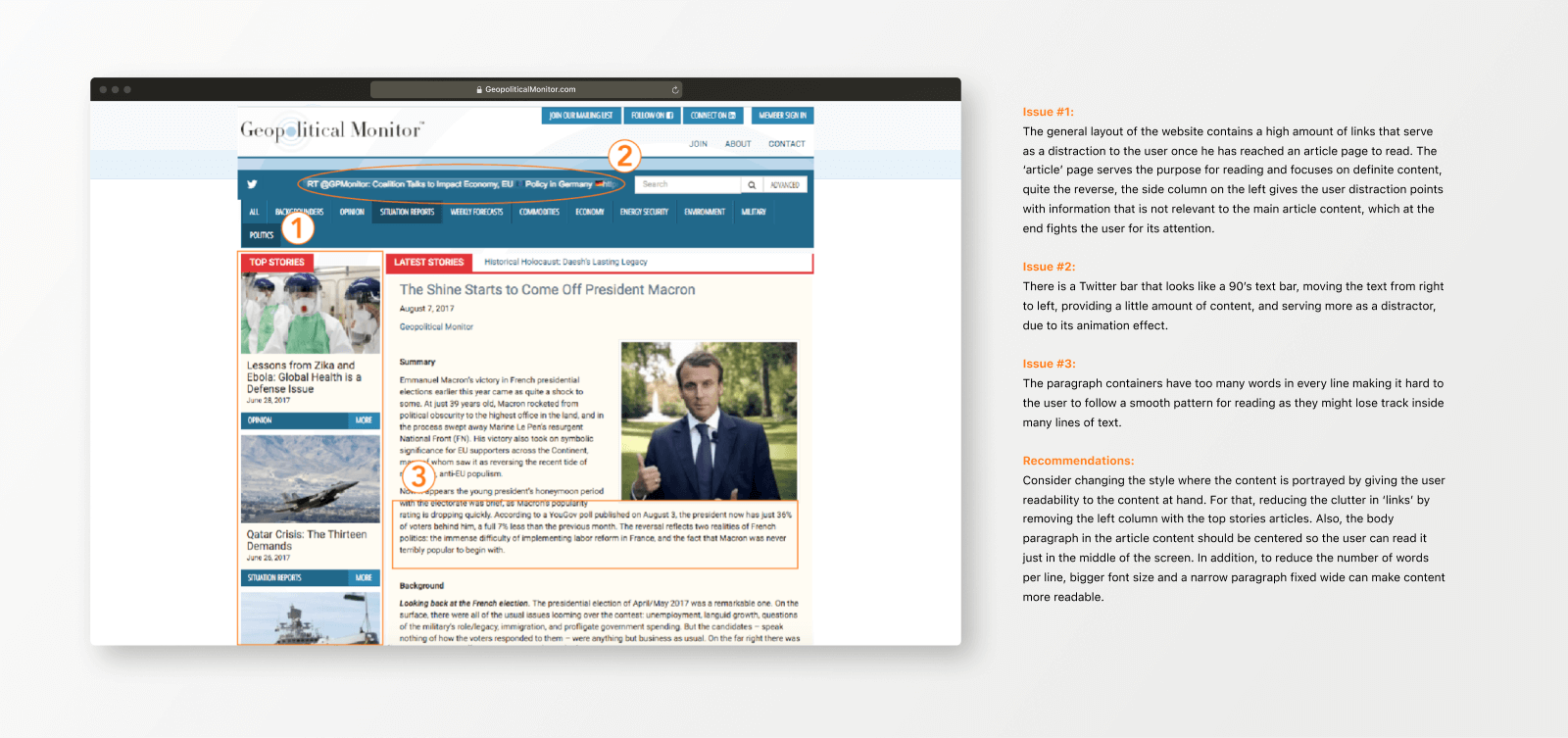
Once we had a good understanding of the problem and audience, I conducted a heuristic evaluation. The purpose was to identify gaps and faults and address them as we worked towards the requirements to build a responsive experience.
Comparative Analysis
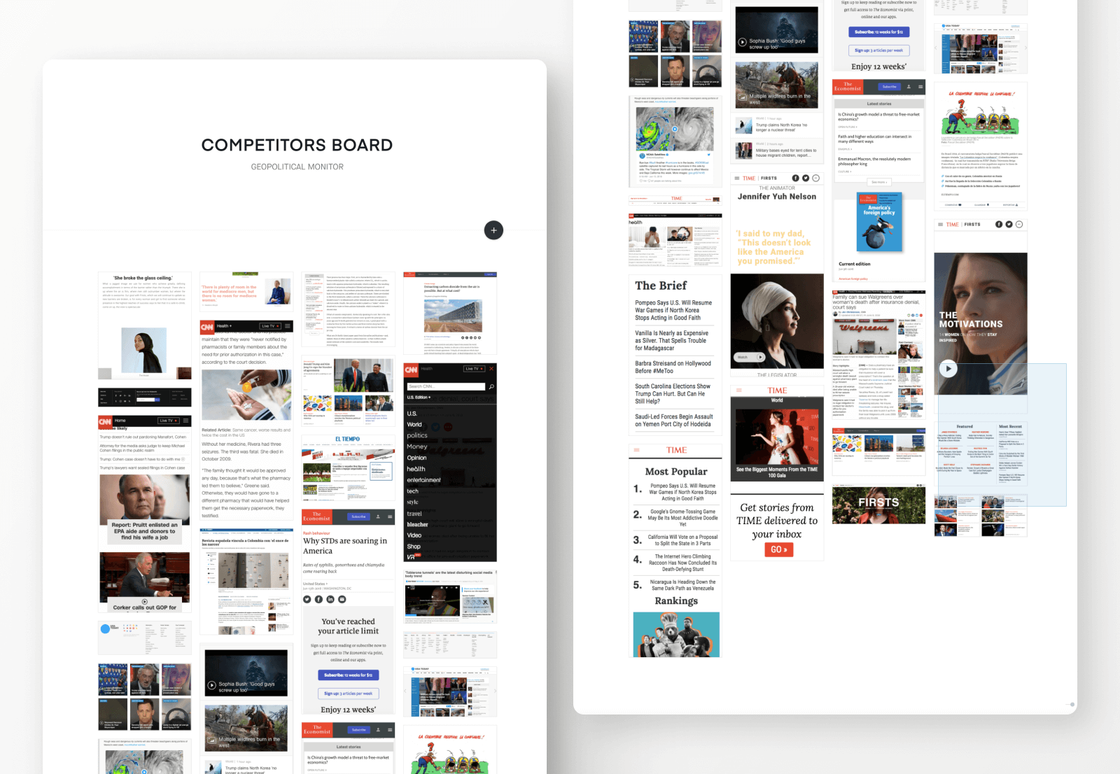
Next, I reviewed and analyzed five competitors from their aesthetic style, content structure, and usability. As I came across exceptional features on some sites, I observed similarities and general rules of thumb that added value to its products.
Design
Wireframes
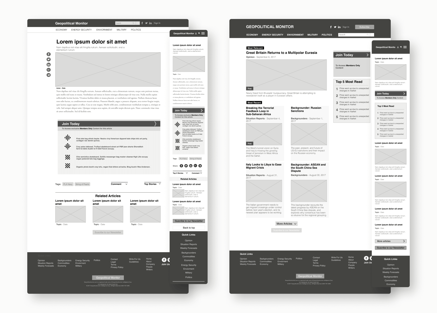
The next step after research was to brainstorm features and put some preliminary thoughts on rough sketches.
Visual Interface
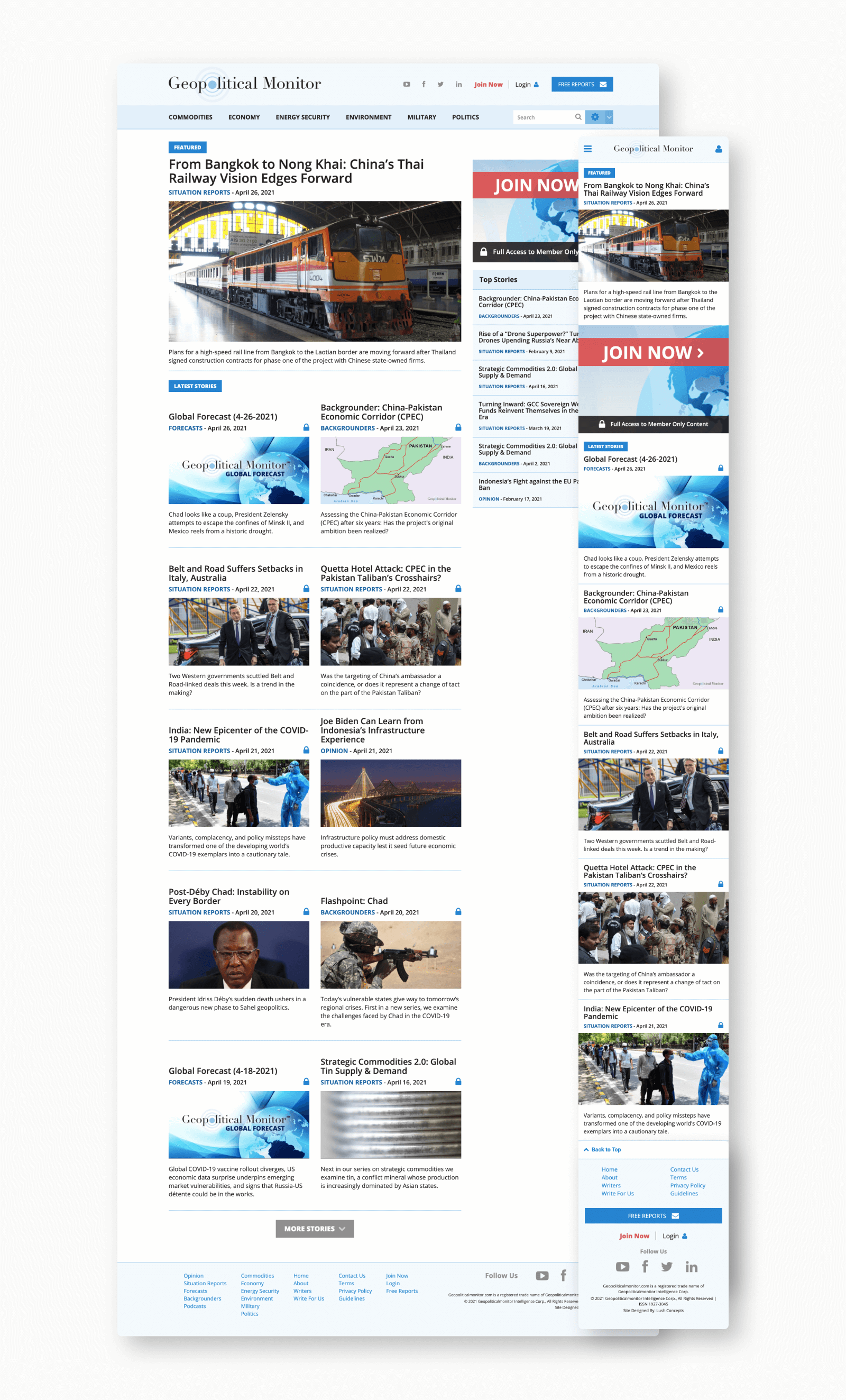
After creating the wireframes, I presented the designs to my team and shared them so we could start working on the UI aspects, and stack development of the site.
Key takeaways
- This project gave me an opportunity to meticulously consider the client’s vision and user interactions and act as an advocate for the improvement of both. Coming up with a concept, doing research, and creating a design, illustrated the importance of understanding limitations and constraints, as well as when to push edges.
- Getting a revamped site doesn’t mean tossing the old site. It was a review of what the current state was doing for the users, what it lacked and how it was bringing value to the business.
- As a UX Designer, I had to consider the scale of technical feasibility, timelines, and capabilities of the project. They key to success was a constant collaboration with the team, especially developers.