UX DESIGN + UX STRATEGY + IA + UX RESEARCH
Rogers for Business
Browse transformation
An interactive strategy to boost the client’s online presence
Role Overview
Role Activities
Journey mapping
IA
Content strategy
Wireframing
Key Responsibilities
Analyzing requirements
Establishing scalable direction
Collaborating with stakeholders
Creating wireframes and scalable components
Collaborations
Product
Engineering
UI Design
Marketing
Content
UX Research
Project Overview
Problem
As the UX strategist for the Rogers for Business design team, we introduced a new process to completely revamp the browse pages at the corporate offer on Rogers Communications. The former version and strategy of the browse pages relied on practices that didn’t match today’s business goals and conflicted to provide a useful experience for its business customers.
Solution
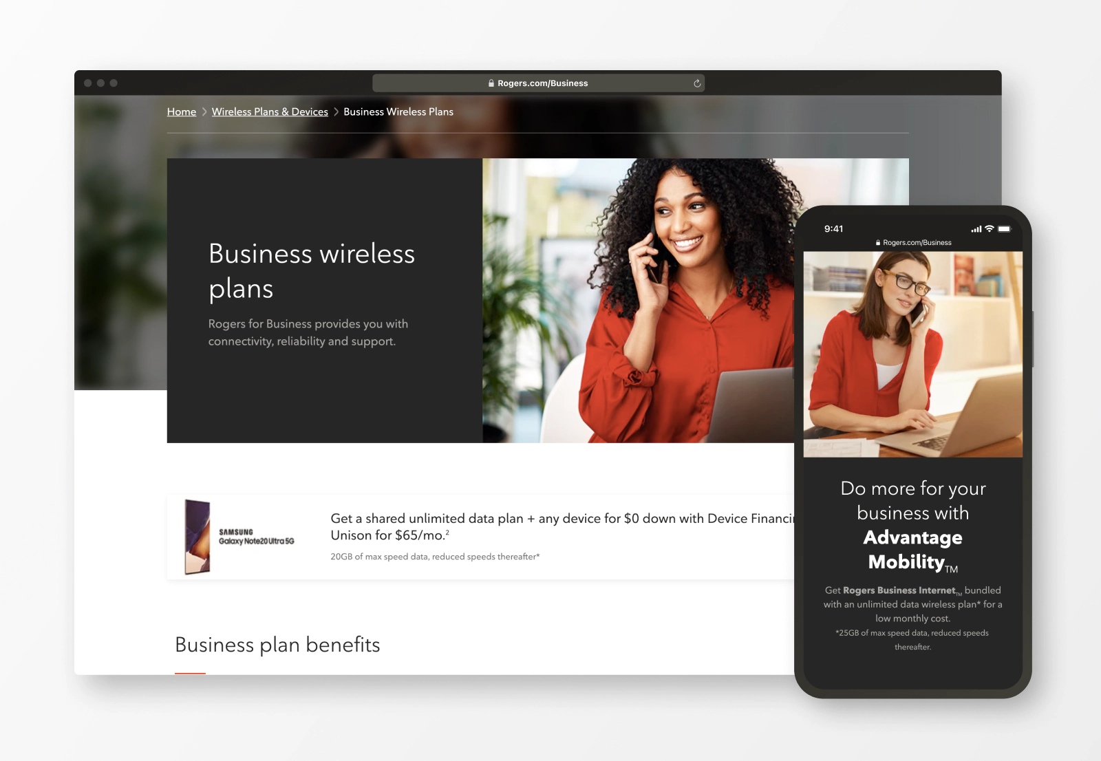
A completely redesigned browse experience focused to serve all customer’s stages. As well as an updated model for the organization to create, maintain and launch pages that are usable for the users. Visit the live website.
Impact
An updated model and technologies provide the organization with more power to handle a fast-paced environment, stay competitive and react faster to changes in the market.
Performance Results
Conversion Rate
+625%
CTR
+1200%
Bounce Rate
-74%
Design Process
Our team followed a conceptual framework for experience design that allowed us to transition from abstract to concrete.
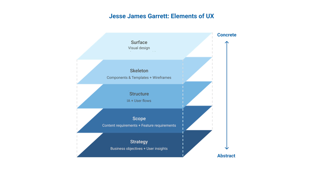
Starting on the base at the Strategy level we made sure to involve the right methodologies to build our way up to the Surface level and provide a final product to our end users.
Strategy
Business Objectives
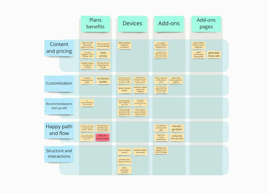
To align with our business stakeholders, we conducted multiple Design Thinking sessions that allowed the team to extract the vision, know-how and spark ideas to transform the Rogers for Business experience. In addition to this session, multiple meetings were conducted to gather business objectives and ultimately define the problem.
Excerpts from Design Thinking sessions
User Insights
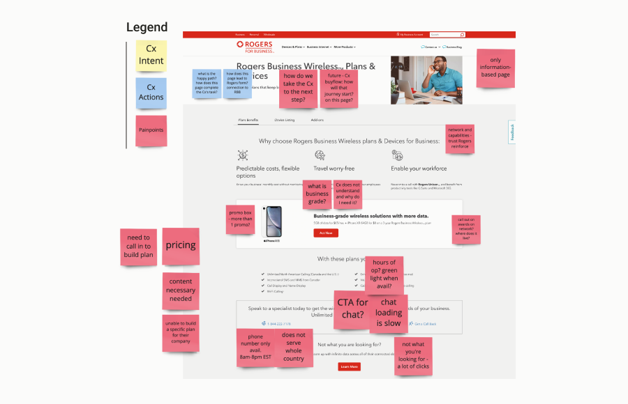
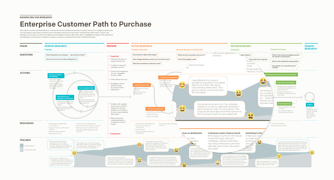
Our team joined forces with the UX research team and with their help we interviewed existing and prospective users of the Rogers for Business suite of services. Our discovery led us to map an updated user journey, as well as the differences that were among different organizational roles.
Scope
Content Requirements
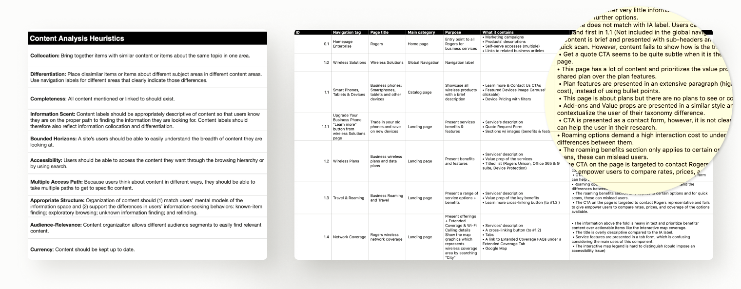
In parallel to the user interviews and cross-teams’ collaborations, I led our team to conduct a content inventory and audit of the former browse experience. We recorded and reviewed 177 pages against content and usability heuristics.
Feature Requirements
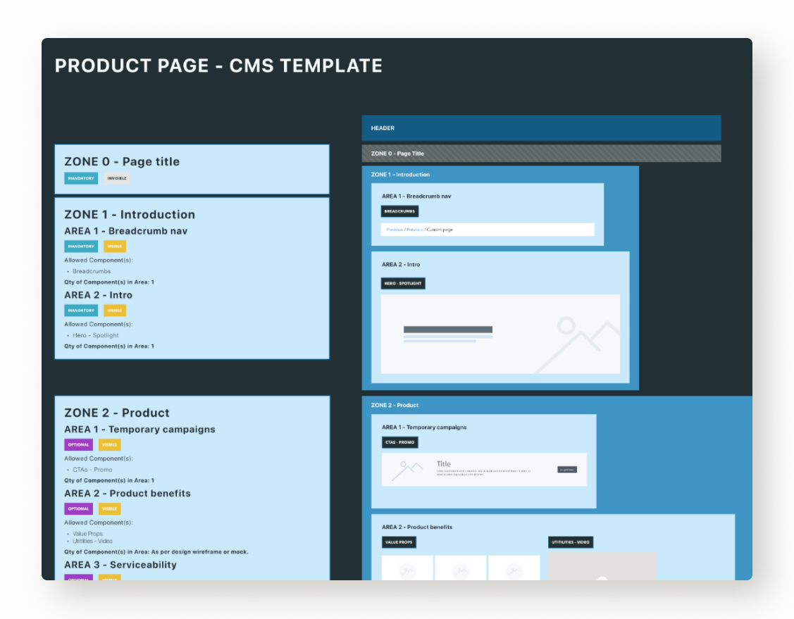
Just as the content review in the former experience took place, I analyzed the insight gathered from our stakeholders, user interviews, and new technology capabilities to outline a scalable framework to redesign multiple pages. New features were aimed to be scalable, and custom for different users based on their journey.
Structure
Information Architecture (IA)
With the preliminary assessment of the content audit and inventory, we engaged key stakeholders and our UX research peers to run a card sorting exercise. The objective was to validate our best assumptions with real users, test findability, and finally inform a path for a cross-linking strategy. After I completed the initial IA, the team had the map to facilitate the future scaling of the website.

User Flows
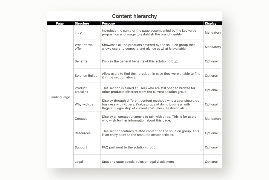
The next thing was to draft the strategy and roadmap for our users to follow. This meant setting up the content and interface hierarchy. Using the IA as our north star, I formulated a set of scalable page journeys that would fit an arrangement of user needs within their journey. The goal was to drive our users to feel confident on each page regardless of the product.
Skeleton
Components & Templates
Part of our mandate was to make this transformation scalable; this is why we opt to consolidate a dedicated design system for Rogers for Business and create page templates to maintain consistency and build at scale.
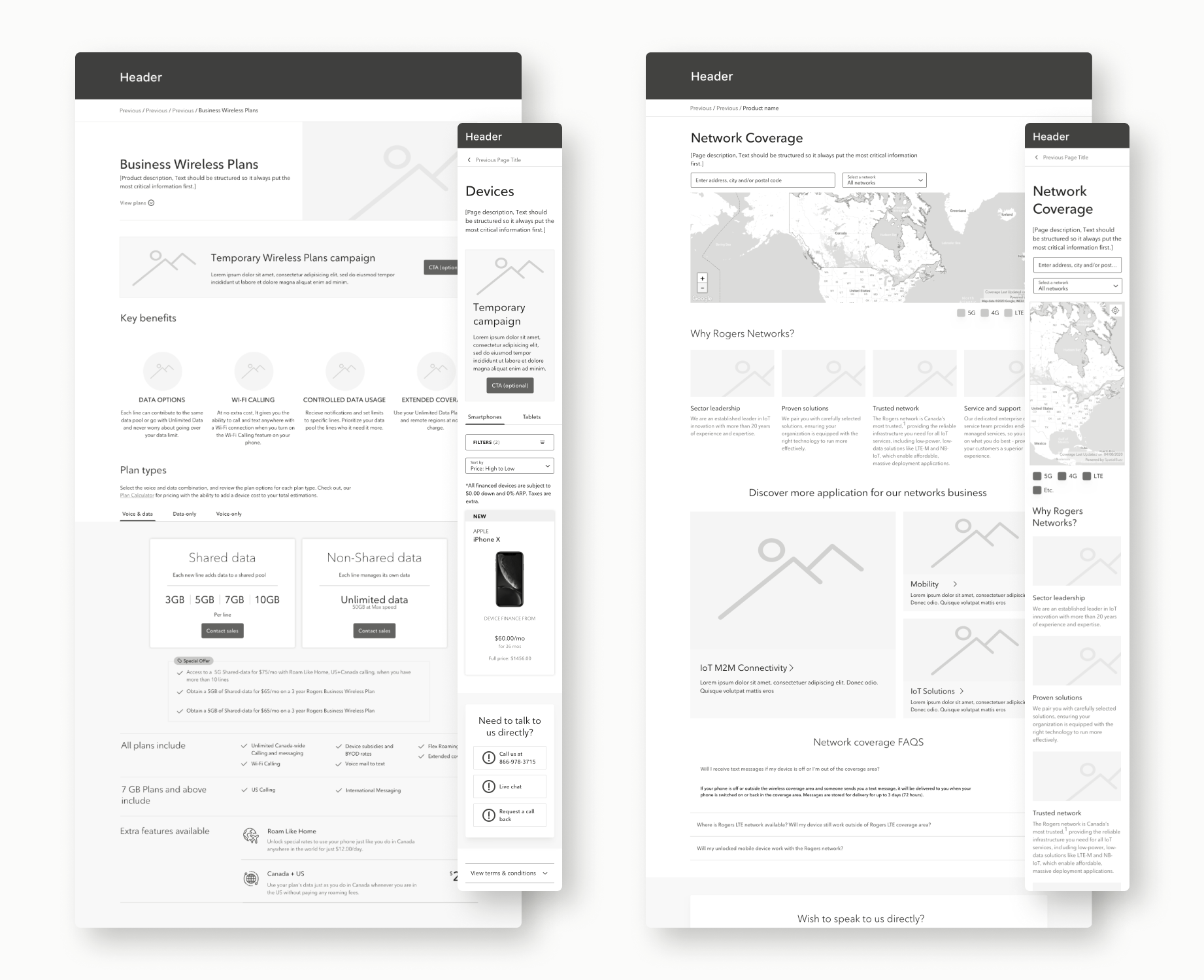
Wireframes
The page templates helped established the content flow and hierarchy for the user to follow. Once I helped established the foundation work, the team started working individually on each product. I began curating the content and work with our content writers’ partners to align the message with our component’s visual hierarchy.
Surface
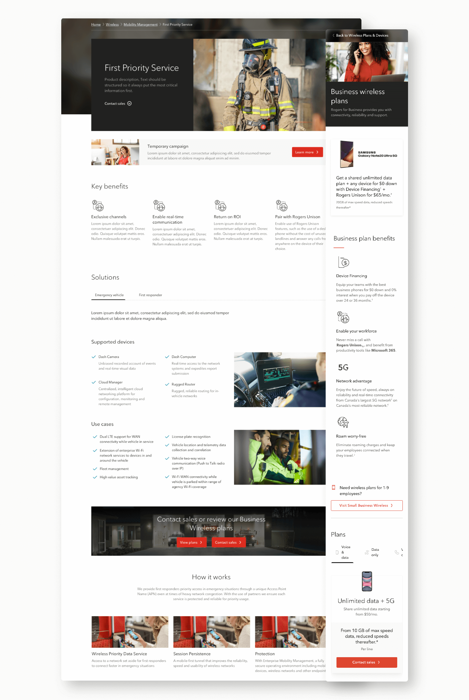
Visual Design
With a strong foundation and data to back up our decisions, our key UI designer led the formation of the Rogers for Business UI guide. By defining the standards of the visual identity, the team aimed to deliver a consistent message and image across all Rogers for Business properties
Key Takeaways
This transformation project took many months to its completion, but by setting strong foundations and new processes the Rogers for Business team can now deliver much faster content to their digital channels and even connect with more channels. As the team changes and evolves, the new foundations are there to keep work on track.
