UX DESIGN + UI DESIGN + MICRO ANIMATION+ UX RESEARCH + MOBILE ACCESSIBILITY
TD Direct Investment
Fractional Trading
Bringing flexibility into the trading experience
Role Overview
Role Activities
- UX and UI Design
- Accessibility Integration
Key Responsibilities
- Analyzing requirements
- Collaborating with stakeholders
- Creating wireframes and prototypes
- Ensuring screen reader accessibility
Collaborations
- Product Owners
- Developers
- Quality Engineers
- Business Analysts
- Copywriters
- UX Researchers
Project overview
Problem Statement
Traditionally, investors using TD investment platforms were restricted to trading securities in whole units, limiting their investment options and market access. This constraint hindered their ability to implement flexible investment strategies.
Solution
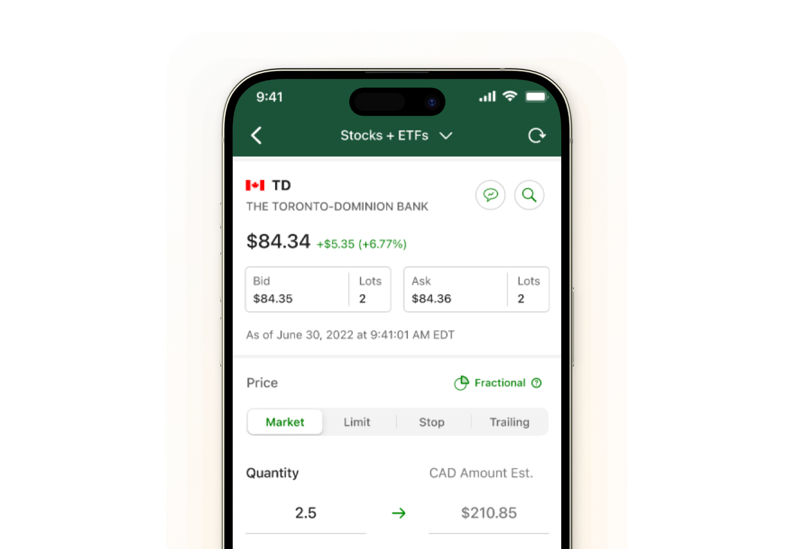
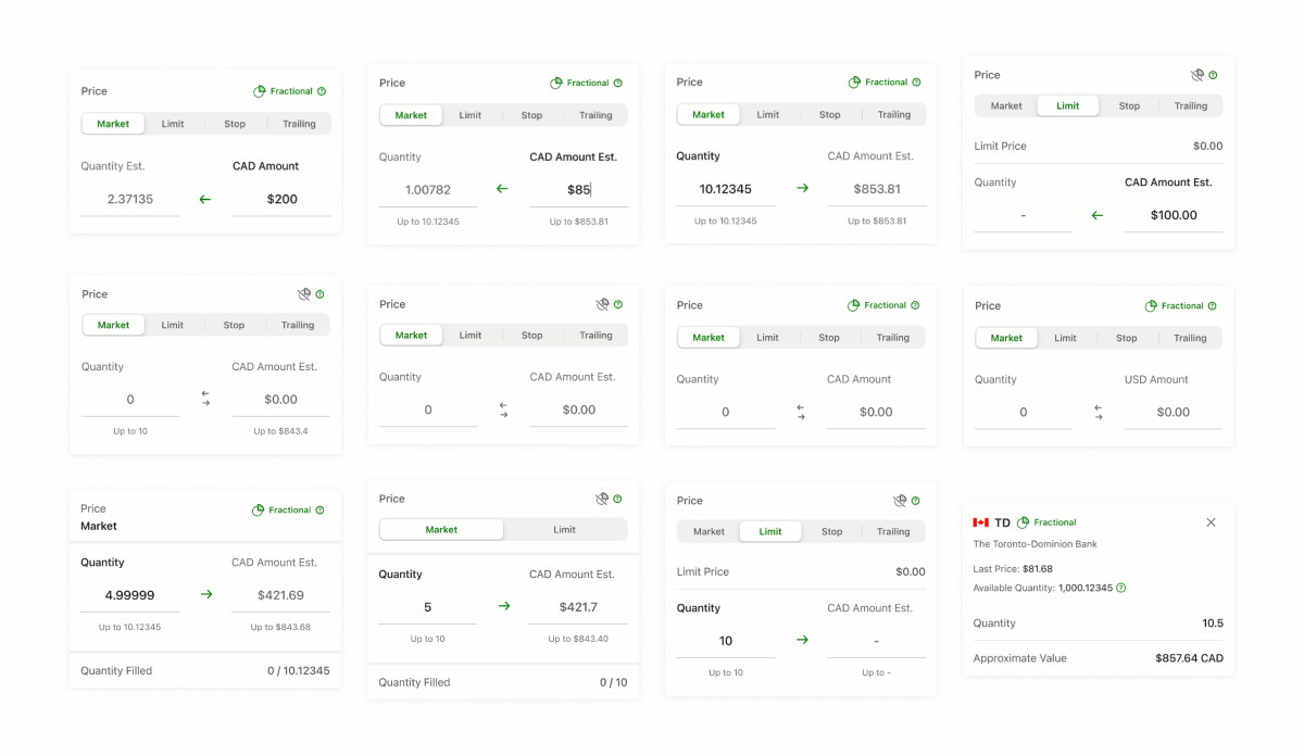
As the Senior Product Designer, I created the design initiatives to empower TD Direct Investment clients in their mobile trading experience, enabling users to trade using either dollar amounts or share quantities. This innovation, a first for the TD mobile app, provides a uniform experience across over 70 different trading scenarios, simplifying a complex system into an intuitive user interface.
Impact
The new model in the experience aligns with investors’ mental models and budgetary constraints, offering unmatched flexibility in trading.
It has positioned TD as a leader in trading flexibility while forecasting a $177MM revenue increase over 5 years.
Design Process
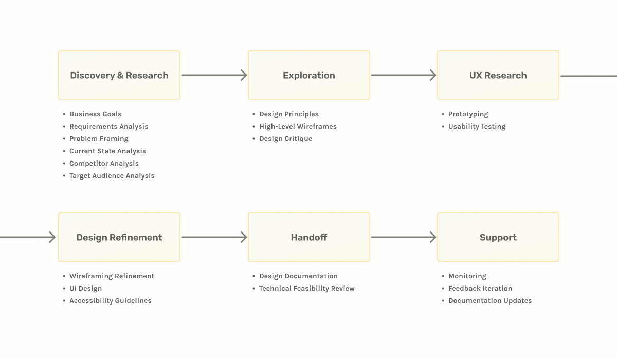
Within the Mobile Investment Pod, I integrated my design methodology with TD’s established Digital Development process, adhering to an agile framework. In my role I was pivotal in guiding the team towards a robust user experience that incorporated design principles, quantitative data, and insights from UX Research.
Discovery
Framing the context
I start by understanding every project’s context, including the problem statement, target audience, and business objectives. By analyzing investment clients’ practices, tracking data, and user research reports, I laid the groundwork for informed design decisions.
Analyzed topics
- Clients’ investment practices
- Company’s tracking data on trading metrics
- Investment foundations
- Company goals and revenue benefits
- User research reports on investment customers
Yield insights in:
User Challenges
- Limited when trading securities
- Dependence on calculators
Business Challenges
- Navigating market competition
- Managing trading complexity
Exploration and UX Research
Designing the Right Solution
As I started exploring ideas for a solution. I leveraged the results of my discovery to help me stay focused on the problem to solve and design within the business and development constraints.
Design Principles
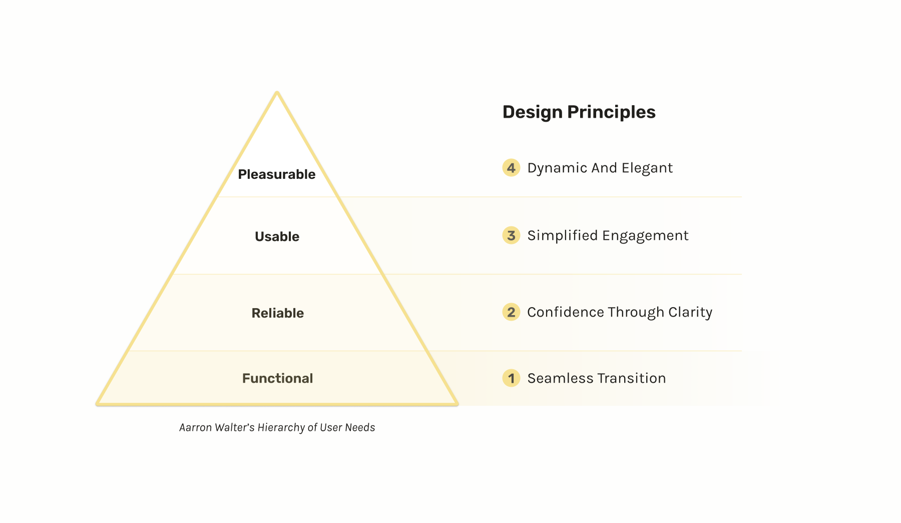
To further direct and strategize my thinking, I followed Aarron Walter’s Hierarchy of User Needs and created a list of design principles that would help achieve a solution that was functional, reliable, usable, and delightful.
Framing the right solution
Equipped with knowledge and principles to direct my decision-making, I developed multiple wireframe explorations and engaged in design critiques with my pod to refine a solution. Feedback was crucial in guiding decisions on front-end enhancements, balancing simplicity and efficiency, and building for future scalability.
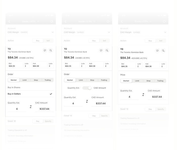
Pod and Leadership Feedback
- Focus on front-end enhancements
- Balance simplicity
- Build for the future
Experience validation and Refinement
Partnering with the UX research team we conducted a usability test where I created a high-fidelity prototype that could handle math operations with the ability to adapt the UI based on the user inputs.
User Testing
To validate the usability and utility of the optimal experience, the Research team and I conducted moderated user testing on two design variants: ‘Efficient’ and ‘Stepped’. We tested both designs with the same participants to gather comparative insights and determine which experience provided the most value.


Insights
The efficient variant received a better response compared to the stepped variant

Think in dollars
11/12 participants typically think in terms of dollars when trading securities.

Efficiency of use
Having all content at a glance (Efficient variant), allowed users to enter trades quicker, reducing errors, and effort to complete their trades.
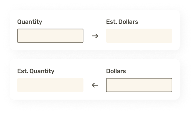
Flexibility of choice
Participants praised the easiness of the ‘Efficient’ variant of choosing quantity or dollar inputs when trading securities.
Accessibility
With a consolidated solution based on the ‘Efficient’ variant, the next step was to create an accessible experience for screen reader users. A custom accessible experience was needed to properly walkthrough users using a screen reader tool.
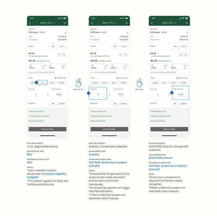
Development handoff
The insights gathered helped tweak inefficiencies and finalize the high-fidelity UI design to be delivered to the engineering teams (iOS & Android).


Key Takeaways
This project exemplified the integration of diverse use cases into a unified trading experience, removing complexity and providing users with unprecedented flexibility. By focusing on user-centered design principles and collaborating across disciplines, we were able to introduce a novel solution that enhances the trading experience for all TD app users.