Rogers for Business · Product Designer
Browse Transformation
Rebuilding a sprawling, 177-page business site around how customers actually research, so the right product was easy to find.
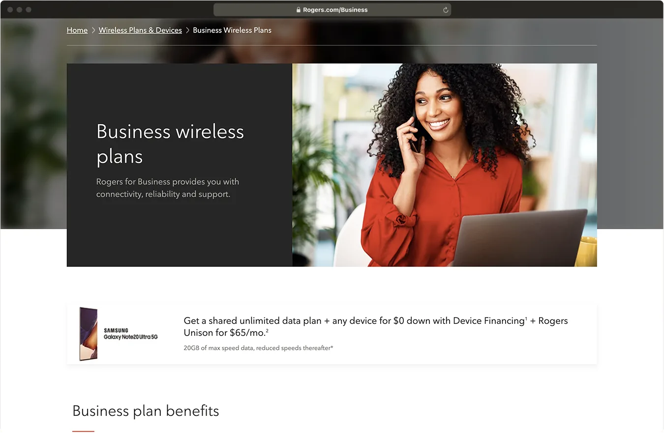
I led the information architecture and content strategy behind the redesign of Rogers for Business, a site first launched in 1995 that had grown to 177 pages of products with no shared structure.
I started from evidence instead of opinion. A card-sort study showed how customers actually grouped these products, and where a single page needed to live in two categories at once. That became a new information architecture and a crosslinking strategy, so people could move from product to product without hitting a dead end. To make it last, I turned the design into reusable content and CMS templates the product team could deploy on their own, all aimed at one person: the researcher comparing options long before they ever talk to sales.

Outcomes
What shipped, and what it moved.
- +625% conversion rate, from 0.4% to 2.9%
- +1200% click-through rate, from 3% to 39%
- −74% bounce rate, from 82% to 21%
Perspectives
Why this project is worth your time, depending on what you came to evaluate.
Product leadership
I made evidence the decision-maker on a 177-page legacy site, and conversion rose 625%.
A card-sort study replaced opinion about how customers group products, and the new architecture and crosslinking strategy were built from what it found. Because the design shipped as CMS templates, the product team could keep deploying content much faster, on their own.
Design
I designed the architecture around the researcher comparing options, not the org chart of products.
The card sort surfaced a wrinkle: participants kept filing the same page under more than one category. So the IA set the structure and naming while a crosslinking strategy absorbed the ambiguity, letting people move product to product from whichever door they entered.
Engineering
177 pages were never going to be redesigned one at a time, so the design shipped as a system the CMS assembles.
Working with engineering, the design became a zone-and-area page specification, each area flagged optional or visible with its allowed components defined. Three handoff documents carried the intent, and pages assemble from the system instead of being built one-off.