TD banking · Product Designer
Statement Tracking
Rebuilding the TD app's credit card statement so cardholders can see what's due, how much, and how much they've paid, at a glance.
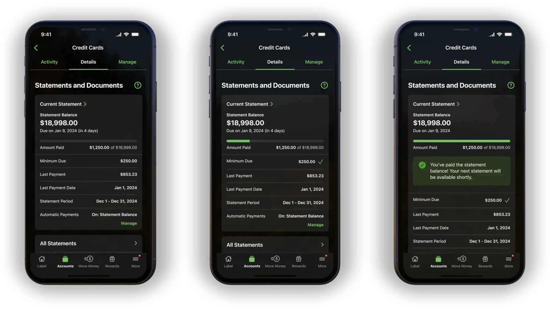
I redesigned the credit card statement in the TD app so a cardholder can see the three things they actually worry about, what’s due, how much, and how much they’ve already paid, at a glance instead of reading a wall of text to find them.
The old screen was faithful to the paper statement, and just as dense. Balance, due date, and minimum payment sat in a flat list with no priority, so every year more people called support simply to understand their own statement. I rebuilt it to be scanned, not read: the facts customers actually call about lead, a payment-progress bar shows whether you’re on track, and everything else discloses only when you go looking. The harder part was earning the engineering effort, so I used proxy research to put a dollar figure on the comprehension gap and prototyped the new experience so stakeholders could validate it rather than imagine it.
Outcomes
What shipped, and what it moved.
- ~18K fewer support calls a year after the redesign
- ~$118K annual cost saved from the drop in call volume
- 10/10 how one customer rated the new payment tracker in feedback
Perspectives
Why this project is worth your time, depending on what you came to evaluate.
Product leadership
I put a dollar figure on a comprehension gap, and that number is what funded the redesign.
With no budget for a full study, support-call volume and survey results served as proxies for the cost of confusion. Partnering with product turned that into a case engineering could prioritize, and the shipped redesign cut roughly 18K support calls a year, about $118K in cost.
Design
I rebuilt the statement to be scanned, not read.
The facts customers actually call about lead the screen: what's due, how much, and how much is already paid, with a progress bar tracking the payment and everything secondary behind progressive disclosure. One customer rated the new payment tracker 10/10 in feedback.
Engineering
The redesign asked engineering for real effort, so it arrived as a working prototype with a measured case, not a deck.
Technical feasibility was the project's hardest constraint. Stakeholders validated the new statement on a working screen instead of imagining it from slides, and because the case aligned user clarity with business value, the extra effort got prioritized.